Behind the Iron Curtain, artists created strikingly trippy ads for the saga, writes Christian Blauvelt.
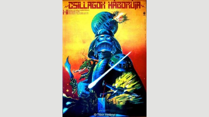
Hungarian Star Wars poster by Tibor Helényi
Star Wars was released in Hungary for the first time in 1980, three years after it came out in the US. Helényi brought his own vision to the saga with a striking palette of blue, orange and red and some features that fans would decry as certainly not being ‘canon’: Darth Vader’s helmet suddenly has a mouth like the grill of a vintage Cadillac; the Death Star is destroyed via a blast out of the side; and then there’s some scaly lizard creature on the left with a flailing tongue and ganglia and an impressively alien-looking scimitar. No such creature exists in any Star Wars film, but Helényi’s approach is to suggest that such an alien could exist in the world Lucas created. Call it ‘added value’! Or perhaps it’s a reference to how Lucas originally envisioned Han Solo as a lizard creature, before going the more conventional route of casting Harrison Ford to play the character as a human. (Credit: Tibor Helényi).

Hungarian Star Wars poster by András Felvidéki
Felvidéki liked to wed old-fashioned engraving and etching techniques with trippy, avant-garde content, and the result for Star Wars looks like an illustration that could have been part of Edgar Rice Burroughs’ Under the Moons of Mars serial in 1912. A steampunk-looking starship of a design never seen in the films shines a light on Chewbacca, whose tongue action is most disturbing. The bantha on the left is infinitely more fearsome than anything seen in the film, and C-3PO suddenly looks like he’s swapped parts with The Wizard of Oz’s Tin Man.
")
Russian Star Wars poster by Yuri Bokser and Alexander Chantsev
")
Russian Star Wars poster by Yuri Bokser and Alexander Chantsev
Where to begin? The odd hieroglyphs around the border? That Vader now has a helmet resembling the face of a jaguar? That he bears a crown of multi-coloured lightsabers? Obviously, nothing here has any relationship to the films – except for that last feature. Before this poster none of the Star Wars films had featured lightsabers of any colour other than blue, green and red. After this poster, the Star Wars prequels and animated TV programmes would introduce lightsabers of different colours, such as Mace Windu’s purple saber. Did this poster have any influence on Lucasfilm’s decision to expand their lightsaber colour palette? Almost assuredly not. But it was an unwitting glimpse of things to come. (Credit: Yuri Bokser and Alexander Chantsev)

Polish Empire Strikes Back poster by Jakub Erol
Would you know this poster was for The Empire Strikes Back, if the actors’ names weren’t listed at the bottom? Jakub Erol’s take on Star Wars’s first sequel evokes Constructivism – a graphic style preferred by early Soviet propagandists anyone in the Eastern Bloc would have associated with authoritarianism. Erol was a prolific poster designer in Poland, and he gravitated to simple, stark images that instantly communicate a powerful idea: his poster for the Czech drama Days of Betrayal, about the rise of Nazism and the appeasement efforts of Neville Chamberlain.
")
Polish Empire Strikes Back poster by Miroslaw Lakomski
Lakomski opted for a more direct approach to the film than Erol. With colourful circles recalling Piet Mondrian and Saul Bass, this poster presents The Empire Strikes Back’s AT-AT walkers and Yoda. But look closer at Yoda: most of his facial features are rendered in black and white, his expression neutral, his gaze off-centre as if he’s looking to the horizon. It’s a classic pose for a heroic sage, but it also looks strikingly similar to Jim Fitzpatrick’s iconic poster of Che Guevara from 1968. A figure from an American film series rendered like a hero of global socialist revolution? A suggestion that aligning with US-backed, capitalist culture was the new rebellion. (Credit: Miroslaw Lakomski)
")
Hungarian Empire Strikes Back poster by Tibor Helényi
Tibor Helényi returned to create a poster for The Empire Strikes Back. No addition of a strange lizard creature here. Instead we get an incredibly detailed Imperial Star Destroyer in the upper left corner, and a strikingly stylised Vader on the lower right. He appears to have a coterie of similarly mechanized henchmen alongside him – if Episode IX should finally reveal the Knights of Ren, let us hope they are half as cool as these baddies. Completing the dynamic, diagonal composition is a Goth AT-AT lurching forward into the frame like an unstoppable steampunk force of nature. Helényi’s work here seems to anticipate the underrated brooding aesthetic artist Cam Kennedy deployed for the Dark Empire graphic novel in 1993, which imagined the resurrection of Emperor Palpatine in a fresh clone body and Luke’s attempts to learn more about the Jedi. (Credit: Tibor Helényi)
 some of his other movie posters, as well. His poster for Ben-Hur depicts the famed chariot race and Christ’s crucifixion by way of Dali’s Hallucinogenic Toreador, while his art for Akira Kurosawa’s Kagemusha imagines a medieval European jouster in place of the film’s story about feudal Japan. (Credit: Tibor Helényi)” data-caption-title=”Hungarian Return of the Jedi poster by Tibor Helényi”.
")
Russian Return of the Jedi poster by Yuri Bokser and Alexander Chantsev
Jabba the Hutt’s monumental head is one of the twin poles of Bokser and Chantsev’s poster commemorating the conclusion of the original trilogy – the other is, of course, the Death Star, with star streaks like those seen when the Millennium Falcon jumps to lightspeed in the middle. It’s a fascinating juxtaposition: do the two orbs, one of a moon-sized weapon, the other of a gangster’s head, suggest that authoritarianism enables Hutt-like corruption? A lot to ponder here. (Credit: Yuri Bokser and Alexander Chantsev).
")
Polish Return of the Jedi poster by Witold Dybowski
The destruction of Vader’s helmet here is certainly a spoiler for the end of Return of the Jedi – but it also suggests the destroyed version of Vader’s helmet that we wouldn’t see until The Force Awakens 31 years after Polish artist Dybowski created this image in 1984. Look closer, though, and you’ll see that various cogs and spools that make up a film camera are incorporated into the design of the helmet. Is this a subtle commentary that Star Wars had obliterated cinema and that the global film industry would never be the same? Or is it suggesting that cinema itself is a kind of Vader figure – it can be a force for good or a force for harm, depending upon the intent of the film-maker. (Credit: Witold Dybowski)